"I don't care about what everyone else is doing, or what is popular."
-Namie Amuro
Converted to a smaller file and uploaded in a lower quality to both make the uploading easier, as well as protecting our ownership of the high quality clip.
Wednesday, 7 April 2010
Tuesday, 6 April 2010
Fashion
"I would rather die than have my fans not see me in a pair of high heels."
-Lady GaGa
 I took control over the fashion used within the video. I researched into a mix between avant-garde fashion legends such as Alexandra McQueen and Armani for my model, as well as how I can relate it to avant-garde film. Although, I did not research into the male actor's outfit, and simply used a shady hooded jacket, that would hide his face to almost neutralise his identity-ensuring he isn't a main focus in the video.
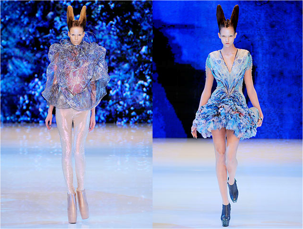
My inspiration for the 'Red Cone' shot below, captured using Windows Media Player, Print Screen and Paint, comes from this picture on the left, from Alexander McQueen's Spring/Summer 2009 Paris Fashion Week Show. My inspiration came from the style of the hair-I wanted to imitate the dramatic way McQueen arranged the heads of his models. Being realistic, I faced the conclusion it would be near to impossible to imitate a look that was entirely similar. But it inspired the idea for a futuristic high-top headpiece, which I created simply out of a large piece of red plastic, and I stuck together with blue tack at the back of my model's head. This look was successful, as it gave my model a dramatic appearance, with the almost horrific blood-red cover shading the rest of her skin in a menacing tone.
 In regards to avant-garde cinema, there is a presence of influence
  as well as full intertexuality in the video. The video makes a notable intertextual reference to Luis Bunuel's avant-garde film 'Un Chien Andalou' (1929) in the 'Knife' scene, shown on the left. The scene it refers to is the opening scene, in which the female lead has her eye cut, as you can see on the right.
 The influence from avant-garde cinema is notably from the era of German Expressionism. On the left is a picture from the 'Glasses Scene'. The glasses are, in fact, needle storage wheels. The needles are all pointing towards the centre, which is where her eyes are-to impress the feeling of fear and intrigue, with the needles so close to her eyes. This refers to German Expressionism because of its
  innovative air, and how it aims to present an unsettled feeling with the audience-as the model poses effortlessly whilst the needles are pointed so closely to her eyes. Another reference to German Expressionism is the reference to the borderline fantasy-esque nature of the films. This is referred to via the crown worn throughout the video, as you can see on the right.
 Also, as shown in previous posts, I made research into the essence of futuristic fashion in modern electro-pop, such as Lady GaGa's television glasses worn in the 'Poker Face' video. Unfortunately, I did not have access to any equipment that
  was as advanced as that. Instead, I found my brother's clip-on torch, as you can see on the left, and clipped it onto our model's outfit, shown on the right. Whilst this was not on the same level of technical advancement as GaGa's iPod screen-based glasses, it still enabled a presence of technology within her outfit, which allows the viewer to presume its futuristic qualities.
In total, the model wears 3 different outfits, with multiple variations (such as scarfs, gloves, glasses and so on):


A red/grey dress, a blue one-piece and a black one-piece. There are two major signs of electro-pop-culture that are apparent: the multitude of outfits and accessories, and consistent sexualisation. The number of costume changes are common in music videos to present the artist in several trademark designs, usually as a means of promotion. For example, all the clothes worn in the video are from the designer brand 'New Look'. It also converts a traditional music video into more of an art installation, presenting variations of artistic fashion creations.

The sexual imagery and showing of skin is also extremely common in electro-pop music videos, as well as pop culture in general. This mainly stems from the 'Sex Sells' theory. The idea of sexuality being used as a form of advertisement has been present in media since the 1800s. On the right is a picture of a promotional image for tire valve caps, from 1921. It shows a scantily clad woman carrying a large tin of the tire valve caps, enticing the viewer to buy the product, praising it. Whilst I do not necessarily agree with the idea of 'selling' a person's body to promote a product, I took the known fact that this process is consistently present in modern culture into consideration.
At present, it is now completely common for an electro-pop artist to show a lot of skin to present both fashion as well as 'selling' their bodies to promote the video to the audience. For example, here are some screen-captures of Lady GaGa's outfits during her 'Telephone' video, taken from her Youtube channel:


-Lady GaGa
 I took control over the fashion used within the video. I researched into a mix between avant-garde fashion legends such as Alexandra McQueen and Armani for my model, as well as how I can relate it to avant-garde film. Although, I did not research into the male actor's outfit, and simply used a shady hooded jacket, that would hide his face to almost neutralise his identity-ensuring he isn't a main focus in the video.
My inspiration for the 'Red Cone' shot below, captured using Windows Media Player, Print Screen and Paint, comes from this picture on the left, from Alexander McQueen's Spring/Summer 2009 Paris Fashion Week Show. My inspiration came from the style of the hair-I wanted to imitate the dramatic way McQueen arranged the heads of his models. Being realistic, I faced the conclusion it would
 be near to impossible to imitate a look that was entirely similar. But it inspired the idea for a futuristic high-top headpiece, which I created simply out of a large piece of red plastic, and I stuck together with blue tack at the back of my model's head. This look was successful, as it gave my model a dramatic appearance, with the almost horrific blood-red cover shading the rest of her skin in a menacing tone.
 In regards to avant-garde cinema, there is a presence of influence as well as full intertexuality in the video. The video makes a notable intertextual reference to Luis Bunuel's avant-garde film 'Un Chien Andalou' (1929) in the 'Knife' scene, shown on the left. The scene it refers to is the opening scene, in which the female lead has her eye cut, as you can see on the right.
 The influence from avant-garde cinema is notably from the era of German Expressionism. On the left is a picture from the 'Glasses Scene'. The glasses are, in fact, needle storage wheels. The needles are all pointing towards the centre, which is where her eyes are-to impress the feeling of fear and intrigue, with the needles so close to her eyes. This refers to German Expressionism because of its
  innovative air, and how it aims to present an unsettled feeling with the audience-as the model poses effortlessly whilst the needles are pointed so closely to her eyes. Another reference to German Expressionism is the reference to the borderline fantasy-esque nature of the films. This is referred to via the crown worn throughout the video, as you can see on the right.
 Also, as shown in previous posts, I made research into the essence of futuristic fashion in modern electro-pop, such as Lady GaGa's television glasses worn in the 'Poker Face' video. Unfortunately, I did not have access to any equipment that
  was as advanced as that. Instead, I found my brother's clip-on torch, as you can see on the left, and clipped it onto our model's outfit, shown on the right. Whilst this was not on the same level of technical advancement as GaGa's iPod screen-based glasses, it still enabled a presence of technology within her outfit, which allows the viewer to presume its futuristic qualities.
In total, the model wears 3 different outfits, with multiple variations (such as scarfs, gloves, glasses and so on):


A red/grey dress, a blue one-piece and a black one-piece. There are two major signs of electro-pop-culture that are apparent: the multitude of outfits and accessories, and consistent sexualisation. The number of costume changes are common in music videos to present the artist in several trademark designs, usually as a means of promotion. For example, all the clothes worn in the video are from the designer brand 'New Look'. It also converts a traditional music video into more of an art installation, presenting variations of artistic fashion creations.

The sexual imagery and showing of skin is also extremely common in electro-pop music videos, as well as pop culture in general. This mainly stems from the 'Sex Sells' theory. The idea of sexuality being used as a form of advertisement has been present in media since the 1800s. On the right is a picture of a promotional image for tire valve caps, from 1921. It shows a scantily clad woman carrying a large tin of the tire valve caps, enticing the viewer to buy the product, praising it. Whilst I do not necessarily agree with the idea of 'selling' a person's body to promote a product, I took the known fact that this process is consistently present in modern culture into consideration.
At present, it is now completely common for an electro-pop artist to show a lot of skin to present both fashion as well as 'selling' their bodies to promote the video to the audience. For example, here are some screen-captures of Lady GaGa's outfits during her 'Telephone' video, taken from her Youtube channel:


Monday, 5 April 2010
Making the Digipak
"I figure the whole world is ours for the taking."
 In school, we were given lessons on how to work on pictures in Adobe Photoshop CS2, to make our digipaks. This program remained available for students to use to create and finalise their digipak, and it is what I have used. An issue that I faced immediately after uploading the photoshoot was my understanding of the presence of the timestamps on each photo:

Due to my camera's settings, I was entirely unable to remove them from the photos, and I was faced with the issue of either trying to remove them or working around them. I decided to remove the timestamps from my selected photos, as they proved to be an interference. To do so, I used the 'Clone Stamp Tool' ( ) in Photoshop. The clone tool imitates the area around the image, which merges the area you want to remove into the background. It works like so:
Firstly I opened the image in Photoshop, and then I selected the Clone Stamp Tool. Then, I selected the area I wanted to clone using a target icon ( ). Then, I spread the stamp, and it clones the background I desire to cover the time stamp:

I used this method on the 4 pictures I chose for my digipak, and here are the time stamp-free pictures:


Now, to begin editing, and creating the final product. My primary objective is to create the image of a traditional pop/electro-pop star, which lead me to a highly conventional motif in Photoshop:airbrushing.

The first step to airbrushing is to press Ctrl+J to create a 'Duplicate Layer', duplicating the image to overlap the original image. Then, I place it into another group by pressing Ctrl+G, for editing purposes. The result is the Layer box to the right.
 I then select my new layer, and then use the Surface Blur filter. This process smooths the skin, softening the image, as you can see on the left. Then, I create a new layer above it, and I change its blend mode to 'Hard Light'. With these settings, this layer will allow me to add texture to my model's skin, and will allow my airbrushing to look realistic.

Then, on this 'Texture layer', I pressed Shift+F5. This activates the Fill Tool, which allows me to apply a grainy, slightly gray coating over the picture. After adding noise to the image, and blurring it with the Gaussian Blur as you can see on the right, the grainy coating blended in to the skin color, making my editing of the skin look realistic thus far.
 I then used the Eye Dropper Tool (
 ) to select the average color of my model's skin. I used the information the Color Palette provided me from the Eye Dropper Tool to then change the Hue, Saturation and Lightness, by pressing as you can see on the left. This caused the color of the image to even out towards one specific skin tone, evening out the skin and balancing the color. This removed the visibility of pores and so on, as the image became a consistent color.

I was then faced with the issue of the entire picture having its color changed, opposed to just the skin. I needed to crop my editing so that it only effected my model's skin, and not her glittery lips, eyes and so on. So, I apply a Layer Mask on the folder containing my Texture and the copy, and choose the option Hide All. This hides my color editing, and reverts to the original picture. I then simply draw over her skin using a blurred brush, and then her edited skin color comes through, as you can see on the right.
Thus concluding my editing. The transition is only clearly visible upon clicking the images below, seeing the zoomed in detail:
---->
I repeated this process where necessary on the other photos. The next requirement I faced was changing my picture's sizes to match that of a digipak, as well as stylizing the pictures to match my theme, as well as my research.
My first requirement was to meet the requirements of the avant-garde genre. Avant-garde refers to people and pieces that are both innovative and experimental. This alternative form of imagery remains present in my repertoire of images-the dramatic purple-glitter for lipstick, the 'starry mouth', the throwing up of glitter and so on. So, a primary goal would be to closely capture the essence of the avant-garde qualities within my pictures.
The pictures also closely relate to German Expressionism. German Expressionism, around the 1920s-1930s, expressed an air of insanity and madness, whilst notably symbolising themes and ideas-whilst being credibly stylised. Dramatic images such as the 'Thowing Up Glitter' shot clearly portray a sense of insanity, shocking the viewer. I have personally had experience in presenting the image to friends of mine, and some have had to turn away in disgust. This shows how effective the image is and, much like German Expressionist films and imagery, instilled horror.
Another requirement I need to meet is that of changing the picture's size's to match the traditional size of CD dimensions, whilst capturing my desired sections of the image. So I found, on Google Images, a set of diagrams detailing the different dimensions necessary to create a digipak:


Using these templates, as well as resizing the pictures, adding text and so on, here is my completed digipak:


The primary font is called 'CassandraTwo'. I chose it because of its futuristic appearance, and again chose the colour purple to match the artist's name, Ultra Violet. An absence I'd like to point out is the title of the album, 'Perfect Circle', from the front cover, as well as the full artist name. I decided to do this based on research I made on what defines musical 'icon', and how to present oneself as an icon. I wanted to give the impression that my artist is at such a high position that she doesn't need to present clear details of the product.
An icon is someone who has an essentially iconic position in the music industry, and has less of a need to present important details such as the artist's full name, the title of the album, the name of the artist and so on-by presuming the audience already knows. For example, Madonna is commonly referred to as 'M', and Michael Jackson can be referred to as 'MJ'. Both the artists and their albums rely on prior promotion to allow the public to understand what they are releasing. I essentially wanted to give the impression that my artist is at such a high position that she doesn't need to present clear details of the product.
Examples of albums that don't clearly list the album name, the artist name or both:


On the back cover, I created a tracklist, to give the album an authentic air. To increase the look of authenticity, I also included a traditional bar code and a short paragraph detailing the copyright, as well as Kevin MacLeod's website's logo. Also, to entice audiences of the modern generation, I decided to include references to the new convergent forms of media. Most, if not all major music organisations are now using convergence as a way to reach wider audiences, and to promote their artist's on a larger spectrum.
I presented convergence firstly by pointing out a bonus feature, being the 'Perfect Circle (Video)'. This tells the listener that the CD inside is a multi-format disc, and that it contains both the album as well as the video. I also included the website addresses for an official website (ultraviolet.com), a Myspace page (myspace.com/uv) and Incompetech's official website (incompetech.com). This makes the artist appear more accessible, and essentially opens a larger number of ways to interact with the artist.
-Nicki Minaj

Due to my camera's settings, I was entirely unable to remove them from the photos, and I was faced with the issue of either trying to remove them or working around them. I decided to remove the timestamps from my selected photos, as they proved to be an interference. To do so, I used the 'Clone Stamp Tool' (
 ) in Photoshop. The clone tool imitates the area around the image, which merges the area you want to remove into the background. It works like so:
Firstly I opened the image in Photoshop, and then I selected the Clone Stamp Tool. Then, I selected the area I wanted to clone using a target icon (
 ). Then, I spread the stamp, and it clones the background I desire to cover the time stamp:
I used this method on the 4 pictures I chose for my digipak, and here are the time stamp-free pictures:


Now, to begin editing, and creating the final product. My primary objective is to create the image of a traditional pop/electro-pop star, which lead me to a highly conventional motif in Photoshop:airbrushing.

The first step to airbrushing is to press Ctrl+J to create a 'Duplicate Layer', duplicating the image to overlap the original image. Then, I place it into another group by pressing Ctrl+G, for editing purposes. The result is the Layer box to the right.
 I then select my new layer, and then use the Surface Blur filter. This process smooths the skin, softening the image, as you can see on the left. Then, I create a new layer above it, and I change its blend mode to 'Hard Light'. With these settings, this layer will allow me to add texture to my model's skin, and will allow my airbrushing to look realistic.
Then, on this 'Texture layer', I pressed Shift+F5. This activates the Fill Tool, which allows me to apply a grainy, slightly gray coating over the picture. After adding noise to the image, and blurring it with the Gaussian Blur as you can see on the right, the grainy coating blended in to the skin color, making my editing of the skin look realistic thus far.
 I then used the Eye Dropper Tool (
 ) to select the average color of my model's skin. I used the information the Color Palette provided me from the Eye Dropper Tool to then change the Hue, Saturation and Lightness, by pressing as you can see on the left. This caused the color of the image to even out towards one specific skin tone, evening out the skin and balancing the color. This removed the visibility of pores and so on, as the image became a consistent color.
I was then faced with the issue of the entire picture having its color changed, opposed to just the skin. I needed to crop my editing so that it only effected my model's skin, and not her glittery lips, eyes and so on. So, I apply a Layer Mask on the folder containing my Texture and the copy, and choose the option Hide All. This hides my color editing, and reverts to the original picture. I then simply draw over her skin using a blurred brush, and then her edited skin color comes through, as you can see on the right.
Thus concluding my editing. The transition is only clearly visible upon clicking the images below, seeing the zoomed in detail:
---->
I repeated this process where necessary on the other photos. The next requirement I faced was changing my picture's sizes to match that of a digipak, as well as stylizing the pictures to match my theme, as well as my research.
My first requirement was to meet the requirements of the avant-garde genre. Avant-garde refers to people and pieces that are both innovative and experimental. This alternative form of imagery remains present in my repertoire of images-the dramatic purple-glitter for lipstick, the 'starry mouth', the throwing up of glitter and so on. So, a primary goal would be to closely capture the essence of the avant-garde qualities within my pictures.
The pictures also closely relate to German Expressionism. German Expressionism, around the 1920s-1930s, expressed an air of insanity and madness, whilst notably symbolising themes and ideas-whilst being credibly stylised. Dramatic images such as the 'Thowing Up Glitter' shot clearly portray a sense of insanity, shocking the viewer. I have personally had experience in presenting the image to friends of mine, and some have had to turn away in disgust. This shows how effective the image is and, much like German Expressionist films and imagery, instilled horror.
Another requirement I need to meet is that of changing the picture's size's to match the traditional size of CD dimensions, whilst capturing my desired sections of the image. So I found, on Google Images, a set of diagrams detailing the different dimensions necessary to create a digipak:


Using these templates, as well as resizing the pictures, adding text and so on, here is my completed digipak:


The primary font is called 'CassandraTwo'. I chose it because of its futuristic appearance, and again chose the colour purple to match the artist's name, Ultra Violet. An absence I'd like to point out is the title of the album, 'Perfect Circle', from the front cover, as well as the full artist name. I decided to do this based on research I made on what defines musical 'icon', and how to present oneself as an icon. I wanted to give the impression that my artist is at such a high position that she doesn't need to present clear details of the product.
An icon is someone who has an essentially iconic position in the music industry, and has less of a need to present important details such as the artist's full name, the title of the album, the name of the artist and so on-by presuming the audience already knows. For example, Madonna is commonly referred to as 'M', and Michael Jackson can be referred to as 'MJ'. Both the artists and their albums rely on prior promotion to allow the public to understand what they are releasing. I essentially wanted to give the impression that my artist is at such a high position that she doesn't need to present clear details of the product.
Examples of albums that don't clearly list the album name, the artist name or both:


On the back cover, I created a tracklist, to give the album an authentic air. To increase the look of authenticity, I also included a traditional bar code and a short paragraph detailing the copyright, as well as Kevin MacLeod's website's logo. Also, to entice audiences of the modern generation, I decided to include references to the new convergent forms of media. Most, if not all major music organisations are now using convergence as a way to reach wider audiences, and to promote their artist's on a larger spectrum.
I presented convergence firstly by pointing out a bonus feature, being the 'Perfect Circle (Video)'. This tells the listener that the CD inside is a multi-format disc, and that it contains both the album as well as the video. I also included the website addresses for an official website (ultraviolet.com), a Myspace page (myspace.com/uv) and Incompetech's official website (incompetech.com). This makes the artist appear more accessible, and essentially opens a larger number of ways to interact with the artist.
Sunday, 21 March 2010
Ultra Violet Trailer
"I think people are always looking for something different."
-Rihanna
Here is the completed version of my trailer for Ultra Violet's website, which I intend to use as both the main focus of the website, as well as the opening of the DVD:
-Rihanna
Here is the completed version of my trailer for Ultra Violet's website, which I intend to use as both the main focus of the website, as well as the opening of the DVD:
Website Research
"You laugh 'cause I'm different, I laugh 'cause you're all the same"
-P!nk
Lana and I worked separately on our websites. For my website, I was particularly interested in using a trailer video to promote the artist, rather than the actual music video. Before filming a trailer video, I decided to research into trailers other artists have made to promote their image, that they embedded onto their website as a central focus.
Firstly, I looked into the electro-pop artist Goldfrapp's latest promotional trailer on their website, to promote their new album Head First, as well as their new single, Rocket:
The video is composed simply of short clips of Alison Goldfrapp moving in front of the camera, covered in lasers and smoke. The clip also uses an instrumental of their latest song, Rocket. Since this trailer was released before Rocket or its music video came out, the video excites the viewer, preparing them for a future release. Both the outfit and the look of the trailer were used in the music video for Rocket, which I found to be influential on how to prepare the audience for future releases.
Another electro-pop artist, Kerli, also created a trailer for both herself and her album:
The trailer uses dialogue as well as previews of songs from her album, Love Is Dead, to fuel the video. I found the video heavily influential-with the dark concept and the use of lighting, as well as the dramatic cuts and the intense imagery. Notably, Kerli uses glitter in the video-further proving the presence of glitter in the presentation of electro-pop music.
I was also heavily inspired by the use of fashion in Lady GaGa's promotional trailer, The Fame: Part One:
The trailer samples different songs from her album, The Fame, teasing the viewer into appreciating the variety of tracks. The trailer is heavily fashionable, capturing the idea both Lana and I have been interested in from the start-alternative fashion incorporated into everyday society. I was also influenced by the avant-garde themes of the video-the use of French in an American video, the story-telling and the use of fashion are prime examples.
Saturday, 20 March 2010
Ultra Violet Photoshoot
"Sorry if we can't all be original, but I have a mold to break."
-Jeffree Star
Lana and I had different ideas for the digipak, so we each did our own separately.
As part of our research, a prominent artistic factor found frequently in electro-pop artists' image is glitter. Examples of artists that consistently use glitter as an artistic direction are:
Santigold: On her album cover (displayed in previous posts), glitter is a clear thematic device. I found the idea of throwing up glitter fascinating and eye catching, and it played a vital role of inspiration in my photoshoot for the digipak.
Lady GaGa: Famously quoted for 'taking over the world, one sequin at a time', GaGa points out that glitter is an artistic connection she can have with her fans: cheap to buy and widely usable, by using glitter, her fans can be given an easier opportunity to imitate her alternative fashion sense.
Ke$ha: Ke$ha refers to glitter in terms of its use in parties, and how it amplifies the atmosphere of a party she would want to represent on stage. An example of her using glitter in her shows, in the form of a glitter gun (skip to 2:45):
Due to these artistic inspirations, I chose glitter as the prime artistic direction in my photoshoot for the digipak, using the model from the video, Daniella Gordenfelt. I took Santigold's idea of throwing up glitter, and attempted to imitate a similar set of photos-focusing on taking a photo that will shock the viewer. I also wanted to try using glitter in other ways that would enhance the beauty of the model, so I decided to make a 'glittery lipstick' for my model in some photos. I also took a hand-held mirror and poured glitter onto it, to alter the intensity of the reflection.
 The camera that I used to take the photos is the Sony Cyber-Shot 5.0 Megapixel DSC-F717 camera. The camera comes equipped with a 10x Precision Digital Zoom function, which made the photo-shoot much easier for me, as an incredibly high level of precision and quality was very easy to achieve.
I bought a pack of WHSmith's glitter, containing several different pots of different colors, giving me the opportunity to experiment. For the shots of my model throwing up, I practiced with different colors of glitter, to see which would reflect the light in the most interesting way.
To capture my model lunging forwards to throw up successfully, I used a function on my camera called 'Multi Burst'. This enables my camera to take three rapid photos after pressing the 'Take Photo' button once. This way, Daniella could lunge forwards to 'throw up' the glitter, and my camera would successfully capture the quick movement. This plan worked, and some of the pictures are very effective.

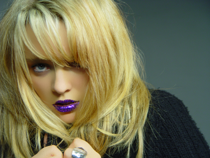
For the close-up shots of my model's face, I used purple glitter. This is because I have decided to use one of these photos as my front cover, and the purple glitter notably embodies the artist's name, Ultra Violet. To stick the glitter to my model's lips, I used conventional peach flavored lip balm, and it successfully held the glitter in place. This created a dramatic effect, and the lighting heavily amplified the borderline-futuristic image I was hoping to achieve.
 For the lighting, I again used the provided equipment in my school's media suite. As you can see in a picture on the left, taken in one of our video shoots, the lighting is highly professional, and there were several lights at different areas in the room-enabling me to experiment with different angles of lighting. This way, I could shine the lights appropriately onto the glitter.
Here is a slideshow of all of the unedited photos I have taken, and I will have to choose 4 of these to compose my final piece:
-Jeffree Star
Lana and I had different ideas for the digipak, so we each did our own separately.
As part of our research, a prominent artistic factor found frequently in electro-pop artists' image is glitter. Examples of artists that consistently use glitter as an artistic direction are:
Santigold: On her album cover (displayed in previous posts), glitter is a clear thematic device. I found the idea of throwing up glitter fascinating and eye catching, and it played a vital role of inspiration in my photoshoot for the digipak.
Lady GaGa: Famously quoted for 'taking over the world, one sequin at a time', GaGa points out that glitter is an artistic connection she can have with her fans: cheap to buy and widely usable, by using glitter, her fans can be given an easier opportunity to imitate her alternative fashion sense.
Ke$ha: Ke$ha refers to glitter in terms of its use in parties, and how it amplifies the atmosphere of a party she would want to represent on stage. An example of her using glitter in her shows, in the form of a glitter gun (skip to 2:45):
Due to these artistic inspirations, I chose glitter as the prime artistic direction in my photoshoot for the digipak, using the model from the video, Daniella Gordenfelt. I took Santigold's idea of throwing up glitter, and attempted to imitate a similar set of photos-focusing on taking a photo that will shock the viewer. I also wanted to try using glitter in other ways that would enhance the beauty of the model, so I decided to make a 'glittery lipstick' for my model in some photos. I also took a hand-held mirror and poured glitter onto it, to alter the intensity of the reflection.
 The camera that I used to take the photos is the Sony Cyber-Shot 5.0 Megapixel DSC-F717 camera. The camera comes equipped with a 10x Precision Digital Zoom function, which made the photo-shoot much easier for me, as an incredibly high level of precision and quality was very easy to achieve.
I bought a pack of WHSmith's glitter, containing several different pots of different colors, giving me the opportunity to experiment. For the shots of my model throwing up, I practiced with different colors of glitter, to see which would reflect the light in the most interesting way.
To capture my model lunging forwards to throw up successfully, I used a function on my camera called 'Multi Burst'. This enables my camera to take three rapid photos after pressing the 'Take Photo' button once. This way, Daniella could lunge forwards to 'throw up' the glitter, and my camera would successfully capture the quick movement. This plan worked, and some of the pictures are very effective.

For the close-up shots of my model's face, I used purple glitter. This is because I have decided to use one of these photos as my front cover, and the purple glitter notably embodies the artist's name, Ultra Violet. To stick the glitter to my model's lips, I used conventional peach flavored lip balm, and it successfully held the glitter in place. This created a dramatic effect, and the lighting heavily amplified the borderline-futuristic image I was hoping to achieve.
 For the lighting, I again used the provided equipment in my school's media suite. As you can see in a picture on the left, taken in one of our video shoots, the lighting is highly professional, and there were several lights at different areas in the room-enabling me to experiment with different angles of lighting. This way, I could shine the lights appropriately onto the glitter.
Here is a slideshow of all of the unedited photos I have taken, and I will have to choose 4 of these to compose my final piece:
Thursday, 11 March 2010
Covering the Album
"Whatever, I don't need money-I am money.”
-Ke$ha

-Ke$ha
As research for our album cover, Lana and I researched into conventions of electro-pop that are expressed in an intriguing fashion. Prominent aspects of an electro-pop artist's image include glitter, plastic, high fashion, pvc/leather, angular/abstract poses and edgy themes, such as shapes, animals and the future. These aspects differentiate artists from the mainstream, with the concept of flashy fashion and expressive sexuality becoming a theme related to the musical nature of the artist and their image.
Our research lead us to a number of covers:

Santigold - Santigold
I found the concept of releasing glitter from the mouth/throwing it up a very interesting concept. The expression of the artist throwing up a beautiful shining object is shocking but effective, representing the artist's alternative image. This may influence the photoshoot I'll take for the cover.

Kylie Minogue - X
The use of high fashion is very much apparent in the use of the alternative headpiece, as well as the dramatic makeup-the pale white skin, and the deep scarlet lips/nails. Another theme is the futuristic editing of the picture-the image seems to double itself into yellow and red versions of the original picture. This is a reference to the use of 3D glasses, which I have perceived as a futuristic concept.

Perfume - GAME
This cover is clearly futuristic, with the large beams of light placed at interesting angles. The outfits are also largely alternative and interesting, and I found the use of simple props putting forward an eye-catching image very influential.
Subscribe to:
Comments (Atom)