-Nicki Minaj

Due to my camera's settings, I was entirely unable to remove them from the photos, and I was faced with the issue of either trying to remove them or working around them. I decided to remove the timestamps from my selected photos, as they proved to be an interference. To do so, I used the 'Clone Stamp Tool' (
 ) in Photoshop. The clone tool imitates the area around the image, which merges the area you want to remove into the background. It works like so:
Firstly I opened the image in Photoshop, and then I selected the Clone Stamp Tool. Then, I selected the area I wanted to clone using a target icon (
 ). Then, I spread the stamp, and it clones the background I desire to cover the time stamp:
I used this method on the 4 pictures I chose for my digipak, and here are the time stamp-free pictures:


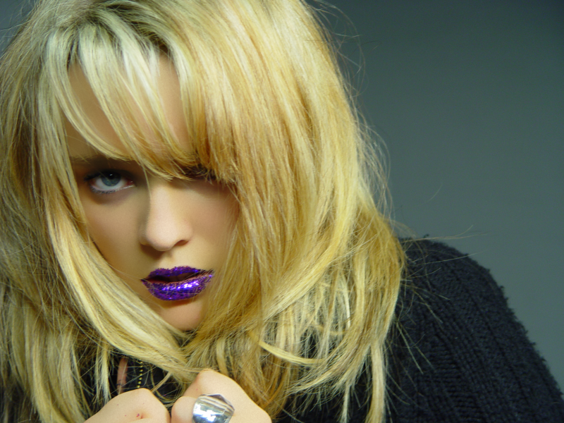
Now, to begin editing, and creating the final product. My primary objective is to create the image of a traditional pop/electro-pop star, which lead me to a highly conventional motif in Photoshop:airbrushing.

The first step to airbrushing is to press Ctrl+J to create a 'Duplicate Layer', duplicating the image to overlap the original image. Then, I place it into another group by pressing Ctrl+G, for editing purposes. The result is the Layer box to the right.
 I then select my new layer, and then use the Surface Blur filter. This process smooths the skin, softening the image, as you can see on the left. Then, I create a new layer above it, and I change its blend mode to 'Hard Light'. With these settings, this layer will allow me to add texture to my model's skin, and will allow my airbrushing to look realistic.
Then, on this 'Texture layer', I pressed Shift+F5. This activates the Fill Tool, which allows me to apply a grainy, slightly gray coating over the picture. After adding noise to the image, and blurring it with the Gaussian Blur as you can see on the right, the grainy coating blended in to the skin color, making my editing of the skin look realistic thus far.
 I then used the Eye Dropper Tool (
 ) to select the average color of my model's skin. I used the information the Color Palette provided me from the Eye Dropper Tool to then change the Hue, Saturation and Lightness, by pressing as you can see on the left. This caused the color of the image to even out towards one specific skin tone, evening out the skin and balancing the color. This removed the visibility of pores and so on, as the image became a consistent color.
I was then faced with the issue of the entire picture having its color changed, opposed to just the skin. I needed to crop my editing so that it only effected my model's skin, and not her glittery lips, eyes and so on. So, I apply a Layer Mask on the folder containing my Texture and the copy, and choose the option Hide All. This hides my color editing, and reverts to the original picture. I then simply draw over her skin using a blurred brush, and then her edited skin color comes through, as you can see on the right.
Thus concluding my editing. The transition is only clearly visible upon clicking the images below, seeing the zoomed in detail:
---->
I repeated this process where necessary on the other photos. The next requirement I faced was changing my picture's sizes to match that of a digipak, as well as stylizing the pictures to match my theme, as well as my research.
My first requirement was to meet the requirements of the avant-garde genre. Avant-garde refers to people and pieces that are both innovative and experimental. This alternative form of imagery remains present in my repertoire of images-the dramatic purple-glitter for lipstick, the 'starry mouth', the throwing up of glitter and so on. So, a primary goal would be to closely capture the essence of the avant-garde qualities within my pictures.
The pictures also closely relate to German Expressionism. German Expressionism, around the 1920s-1930s, expressed an air of insanity and madness, whilst notably symbolising themes and ideas-whilst being credibly stylised. Dramatic images such as the 'Thowing Up Glitter' shot clearly portray a sense of insanity, shocking the viewer. I have personally had experience in presenting the image to friends of mine, and some have had to turn away in disgust. This shows how effective the image is and, much like German Expressionist films and imagery, instilled horror.
Another requirement I need to meet is that of changing the picture's size's to match the traditional size of CD dimensions, whilst capturing my desired sections of the image. So I found, on Google Images, a set of diagrams detailing the different dimensions necessary to create a digipak:


Using these templates, as well as resizing the pictures, adding text and so on, here is my completed digipak:


The primary font is called 'CassandraTwo'. I chose it because of its futuristic appearance, and again chose the colour purple to match the artist's name, Ultra Violet. An absence I'd like to point out is the title of the album, 'Perfect Circle', from the front cover, as well as the full artist name. I decided to do this based on research I made on what defines musical 'icon', and how to present oneself as an icon. I wanted to give the impression that my artist is at such a high position that she doesn't need to present clear details of the product.
An icon is someone who has an essentially iconic position in the music industry, and has less of a need to present important details such as the artist's full name, the title of the album, the name of the artist and so on-by presuming the audience already knows. For example, Madonna is commonly referred to as 'M', and Michael Jackson can be referred to as 'MJ'. Both the artists and their albums rely on prior promotion to allow the public to understand what they are releasing. I essentially wanted to give the impression that my artist is at such a high position that she doesn't need to present clear details of the product.
Examples of albums that don't clearly list the album name, the artist name or both:


On the back cover, I created a tracklist, to give the album an authentic air. To increase the look of authenticity, I also included a traditional bar code and a short paragraph detailing the copyright, as well as Kevin MacLeod's website's logo. Also, to entice audiences of the modern generation, I decided to include references to the new convergent forms of media. Most, if not all major music organisations are now using convergence as a way to reach wider audiences, and to promote their artist's on a larger spectrum.
I presented convergence firstly by pointing out a bonus feature, being the 'Perfect Circle (Video)'. This tells the listener that the CD inside is a multi-format disc, and that it contains both the album as well as the video. I also included the website addresses for an official website (ultraviolet.com), a Myspace page (myspace.com/uv) and Incompetech's official website (incompetech.com). This makes the artist appear more accessible, and essentially opens a larger number of ways to interact with the artist.
No comments:
Post a Comment